← All projects 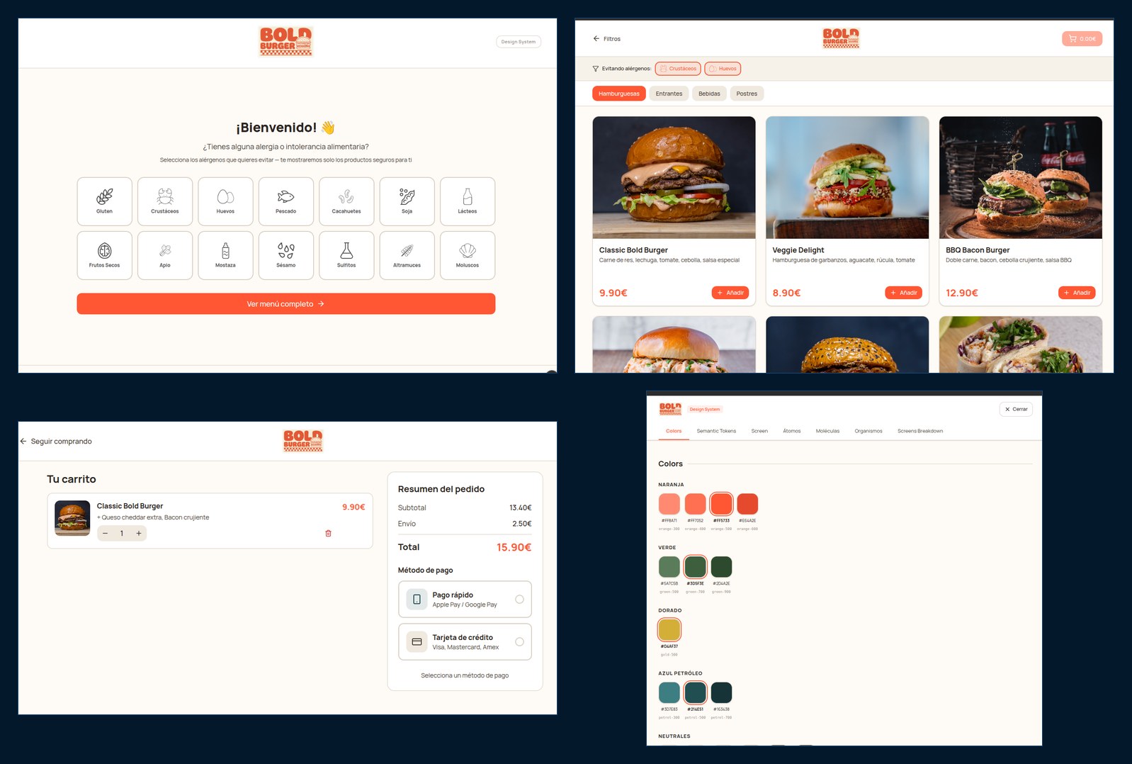
Bold Burger - A UX case study of a fast-food website
A full case study, from user research to a working prototype. We started by auditing Goiko's website, and the redesign flips the work asked of anyone with food allergies: instead of hunting through a separate PDF for what they cannot eat, they filter on arrival and the menu shows only what they can.
The prototype
Screenshots of the high-fidelity prototype. The navigable one is behind the button above.
What it does
- Filter-first as a design decision: the allergen filter comes before the menu rather than being buried in another section, and the menu is recomputed by intersection over the 14 official EU allergens
- Upfront research on Goiko's website and two local competitors: a heuristic review against a checklist (81 out of 100), two personas with their journey maps and an analysis of the conversion funnel
- A bespoke design system following Atomic Design: five colour ramps with contrast validated to WCAG AA, semantic tokens, a type scale and an 8 px grid, kept 1:1 between Figma and the code
- The prototype documents its own design system in a seven-tab screen, from atoms to assembled screens, which doubles as proof that any new view can be built out of existing pieces
- Low-fidelity wireframes on a 12-column grid and a high-fidelity mockup with responsive Auto Layout (mobile, tablet and desktop)
- From design to code with Figma Make, Figma's AI: it generates React + Vite + Tailwind with Radix components, which we exported and checked locally before publishing
- Cross-evaluation against another team's project: SUS questionnaire (82.5 against 65), A/B testing with Tally (85 against 55.8) and an eye-tracking experiment on the other design
- The usability report on the other team closes with concrete findings: vote buttons labelled "ORDER NOW" and red text on black that people never managed to read